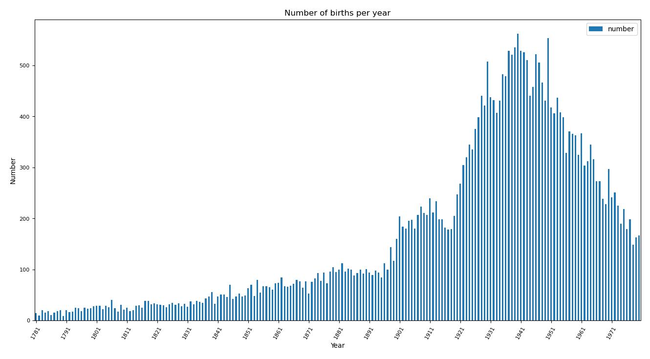
Distribution of births by year
First, we grouped the births by year and created a bar plot to represent them, having dealt with the missing years.
You can find the original notebook here.
First, we grouped the births by year and created a bar plot to represent them, having dealt with the missing years.
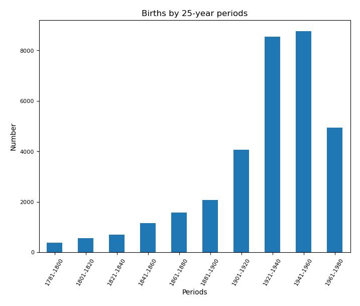
We then grouped the births into 25-year periods to provide a more consistent representation of the evolution. We observed that births doubled in the 1921–1940 period compared to the previous period, which could be explained by a greater interest in physics in the same countries or the geographic spread of physics. The 'encyclopedic bias' should not be overlooked, and a deeper analysis of the information available on Wikidata would be required. This bias probably explains the smaller growth between 1941 and 1960, and the decrease in the final period, which is also visible in the yearly distribution.
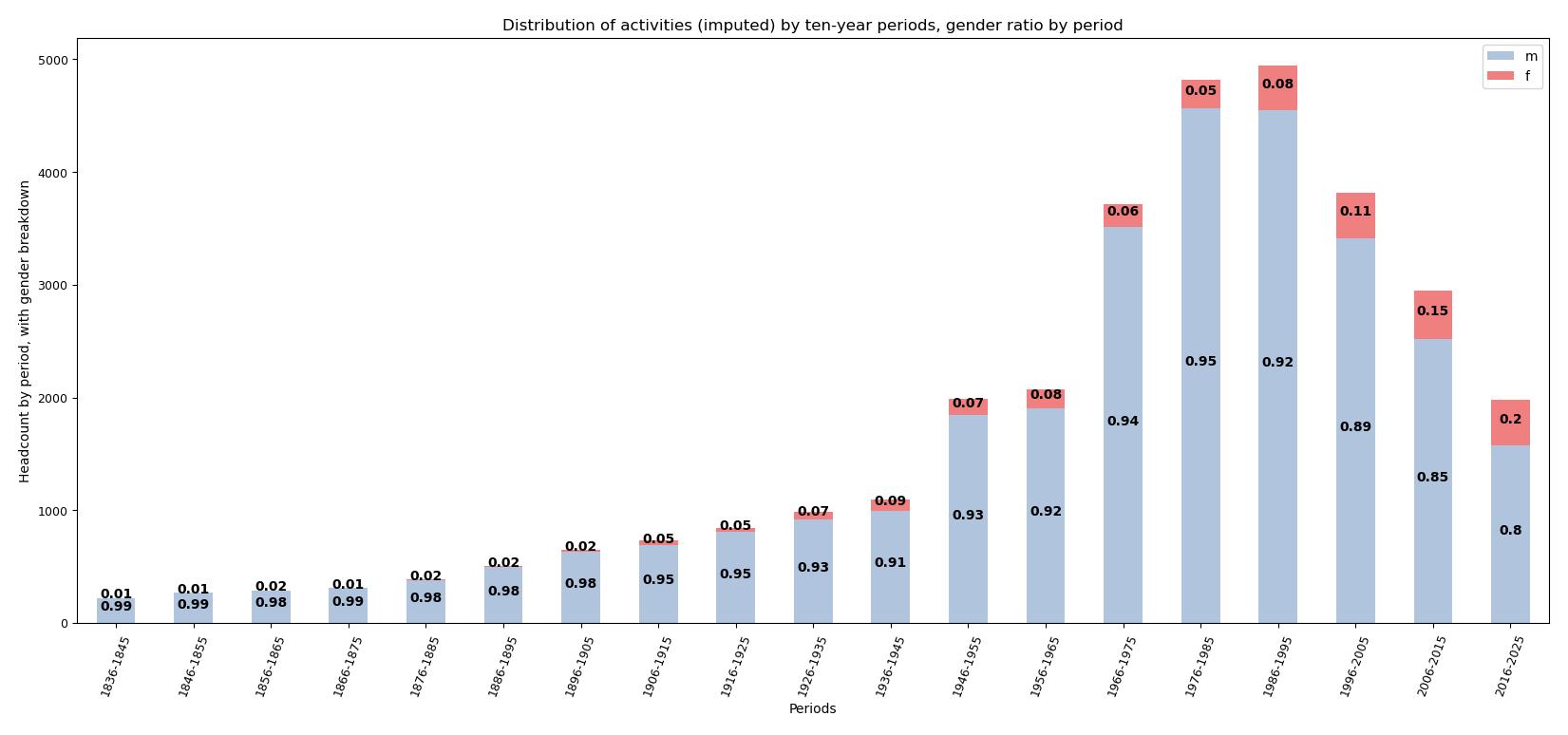
Finally, we decided to use the birth years to create imputed 10-year activity periods (birth year + 45), which allow us to more clearly inspect the trend and observe the periods during which more people were active. We also added the proportion of genders in each period, showing a growing proportion of women in the field, reaching 20% of active individuals in the final period.