Distribution of births on world regions map
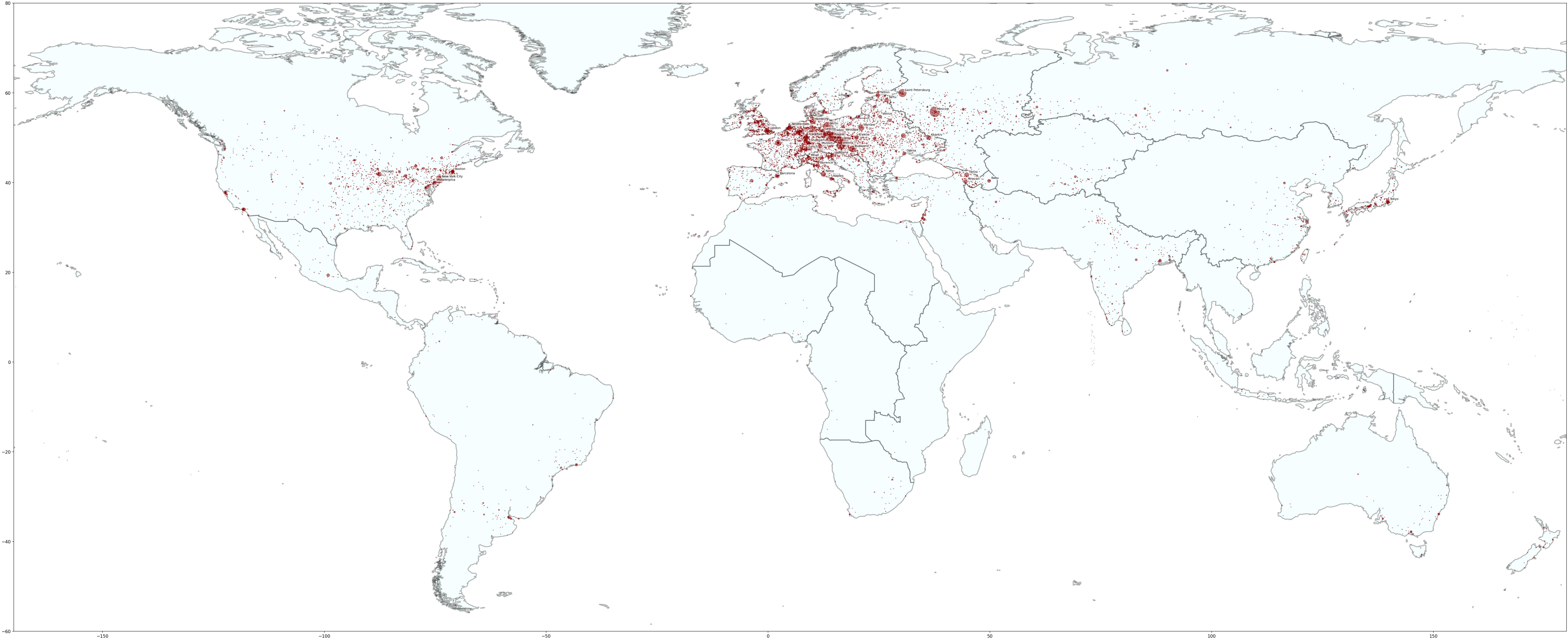
First, we plot the distribution of birthplaces, with the diameter of each circle proportional to the number of people born there.
You can find the original notebook here.
First, we plot the distribution of birthplaces, with the diameter of each circle proportional to the number of people born there.
We then group by periods and produce an interactive dynamic map
Finally, we use regions to group births using a choropleth map
We can also add a dynamic representation of the evolution in time and space as you can observe on this map: Distribution of births in regions and periods